

GAMESPARK logo
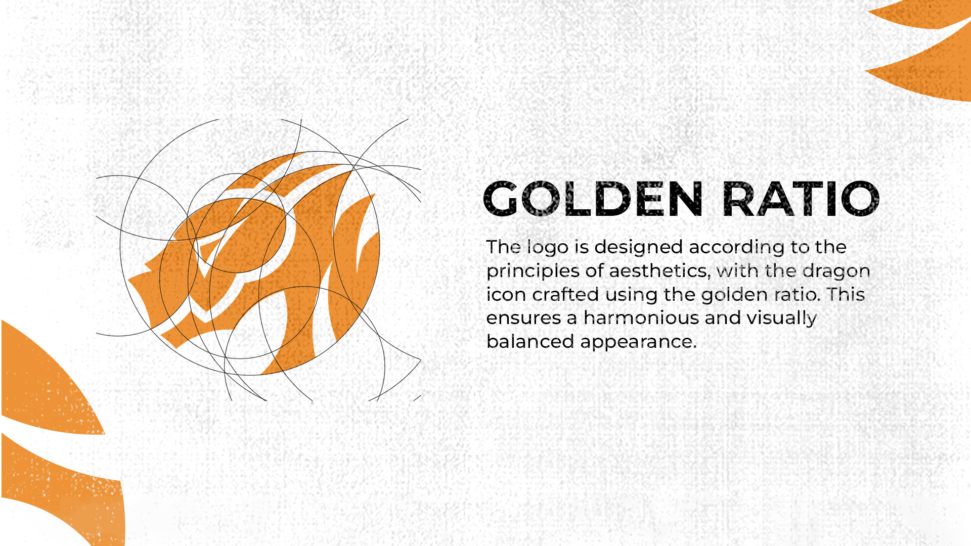
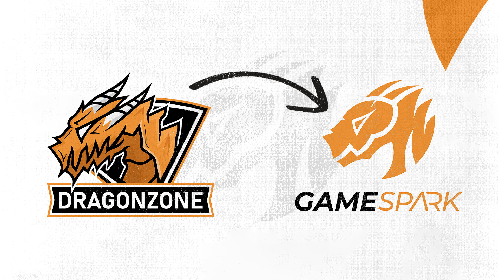
The logo design for GAMESPARK, a sub-brand of TechPark Varaždin, was developed through conceptual research into gaming culture and the visual link with the parent brand. The idea was to shape a contemporary mark that combines the energy of video games with the innovative spirit of the tech community. The logo is based on golden ratio circles, which gives it a balanced, harmonious composition.
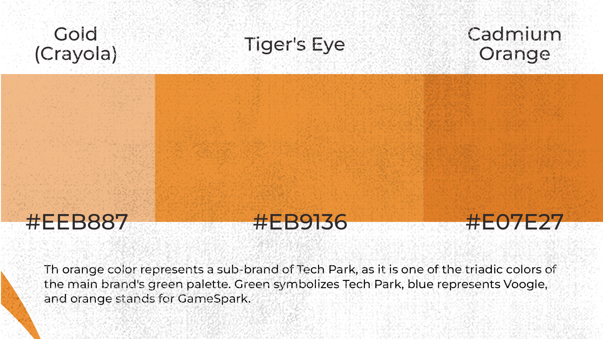
The main symbol, a dragon, was chosen as the mascot because it represents Varaždin's mythical creature, strength and inspiration that connect tradition with modern technology. The logo's colour, orange , symbolises fire, warmth and creativity, and it also completes the colour triad of the brand system: TechPark (green), Voogle (blue) and GameSpark (orange).
The name GAMESPARK combines the words gaming and spark, which together signal the start of a game, an idea or an innovation, while also hinting at the word park, linking the brand to its parent, TechPark.
The process included digital drawing, geometric refinement and precise tuning of proportions for optimal legibility across formats, from web and app interfaces to promotional materials and physical installations. The result is a dynamic, recognisable and professional logo that reflects a spirit of community, play and creative energy.