Rebranding and a campaign for Čarobna frula: when classical meets rock
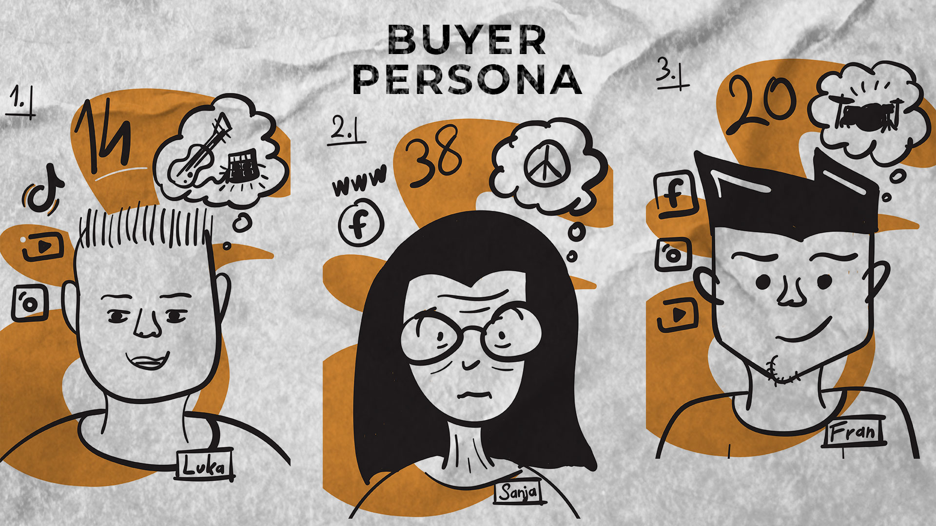
This project continues my collaboration with Čarobna frula, a music creativity studio from Pula, but this time the focus wasn't the website, it was the whole visual identity and campaign. The brief was to refresh the existing logo and create a campaign that speaks both to a 14-year-old guitarist and to an adult who is only just discovering music.
A small shift in the logo
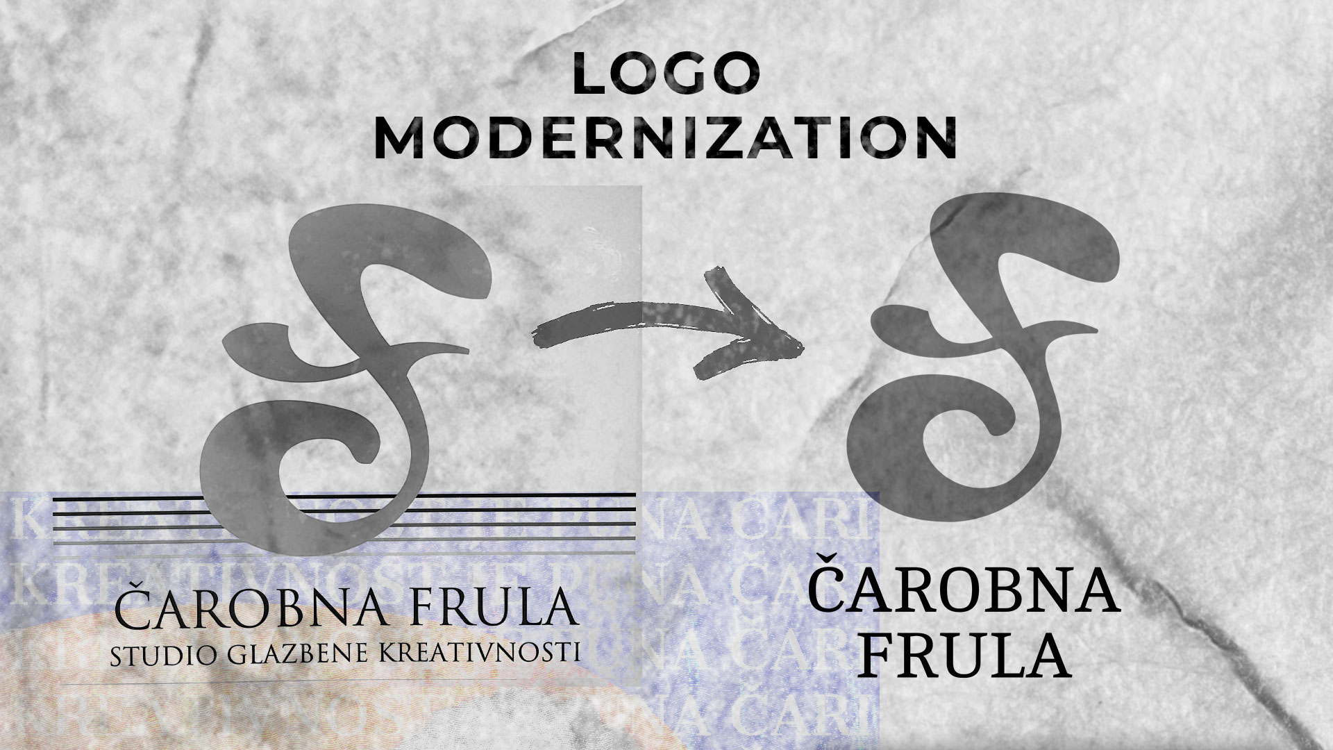
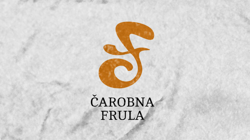
The old Čarobna frula logo had a good idea, but the lines weren't fully aligned. Instead of throwing it away and starting over, I recalculated every curve using the golden ratio, so the shape stayed recognisable, just cleaner and more stable. It's one of those changes people don't notice straight away, but the logo now looks far more professional on T-shirts, posters and the web.
A story told through two vignettes
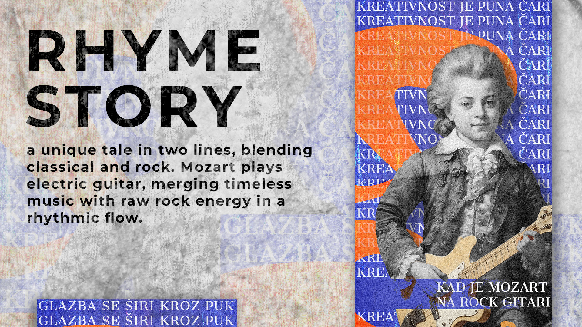
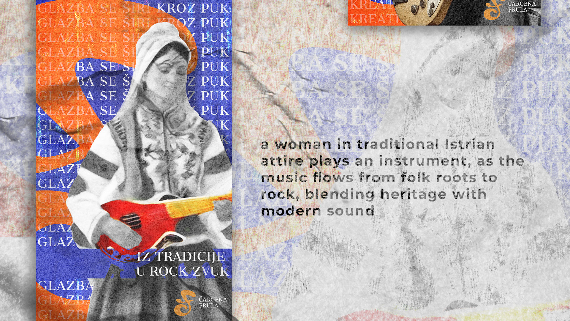
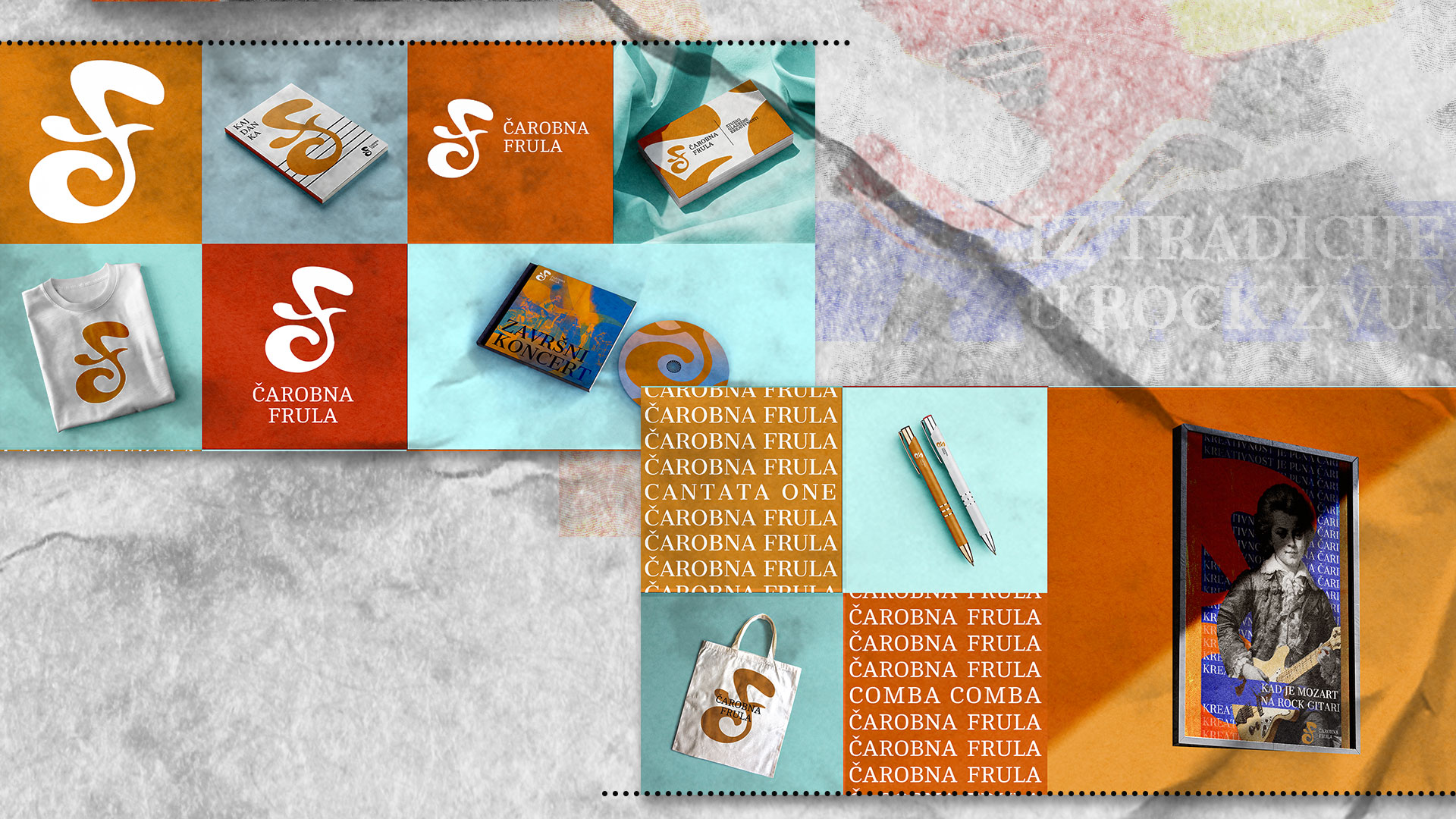
The campaign is built on two visual stories that blend classical and rock. In one, Mozart plays an electric guitar; in the other, a woman in traditional Istrian dress plays a folk instrument that turns into a rock sound. Those two images sum up what the school really does: you learn classical and rock, tradition and something completely new.
Merch, photos and motion
Alongside the logo I designed a whole merch range: hoodies, T-shirts, notebooks and tote bags. I turned some of the posters into short animations for Instagram, because a static poster simply doesn't work in Stories anymore.
If you need a rebrand, a social media campaign or design that has to speak to several generations at once, get in touch. I work on branding, graphic design and visual campaigns for small brands and music projects.