How I design YouTube thumbnails that get clicks
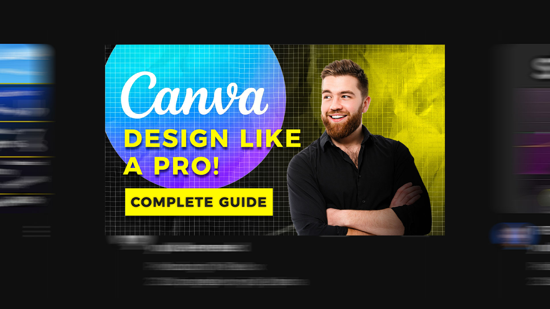
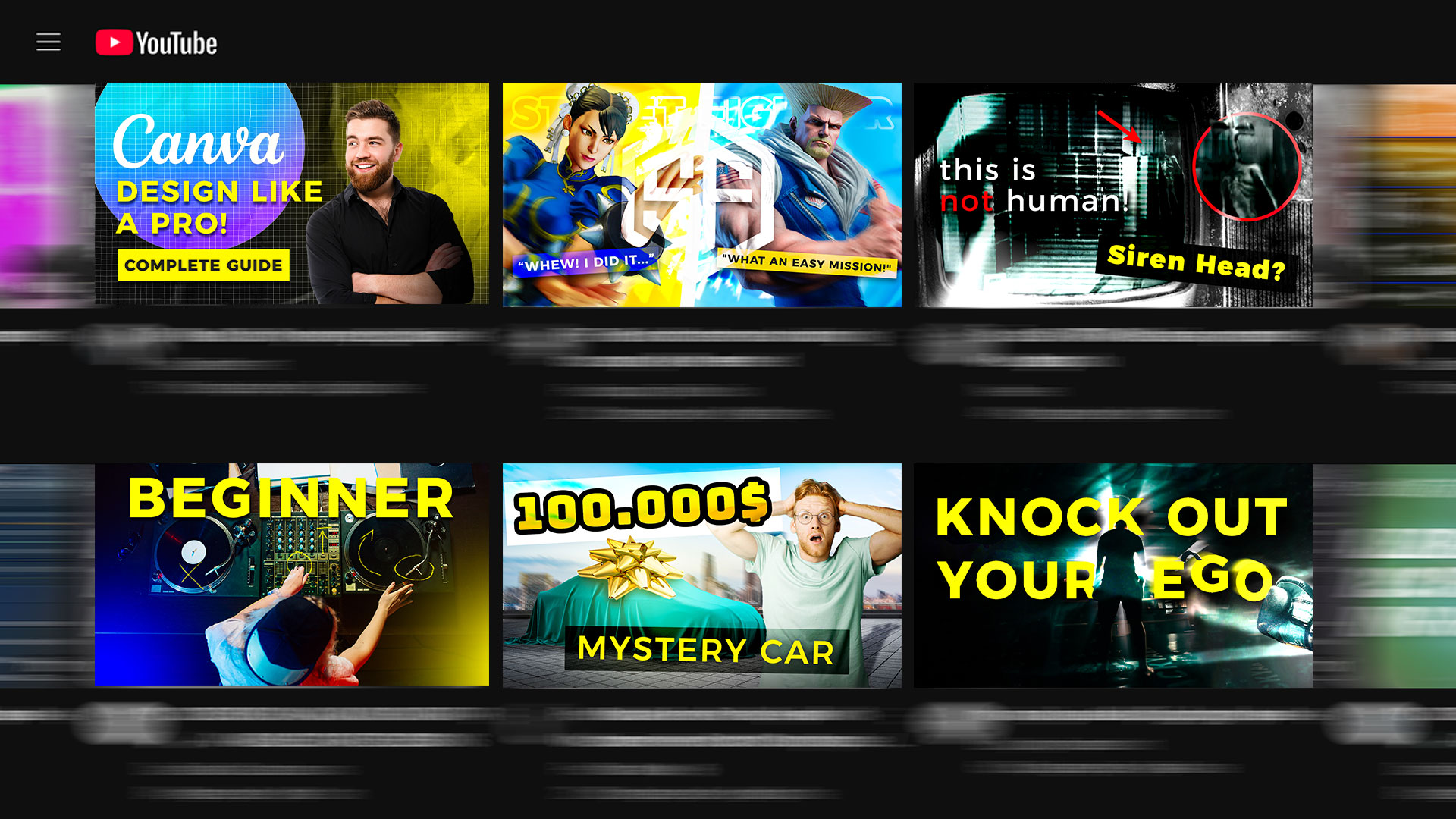
Designing YouTube thumbnails is a special kind of job, because you have literally a split second for someone to click on the video instead of scrolling on. In this project I made thumbnails for different genres, from educational videos to horror stories and sports content, and each one needs a completely different approach.
Every genre has its own visual language
For educational videos and podcasts I use clean, readable typography that communicates value straight away, the classic “how-to” approach. For gaming content I go for expressive faces and dramatic lighting, while for horror and conspiracy theories I use muted tones and ominous elements that spark curiosity. Every niche has its own click psychology, and the key is understanding what the audience expects before you even open Photoshop.
MrBeast style and sports energy
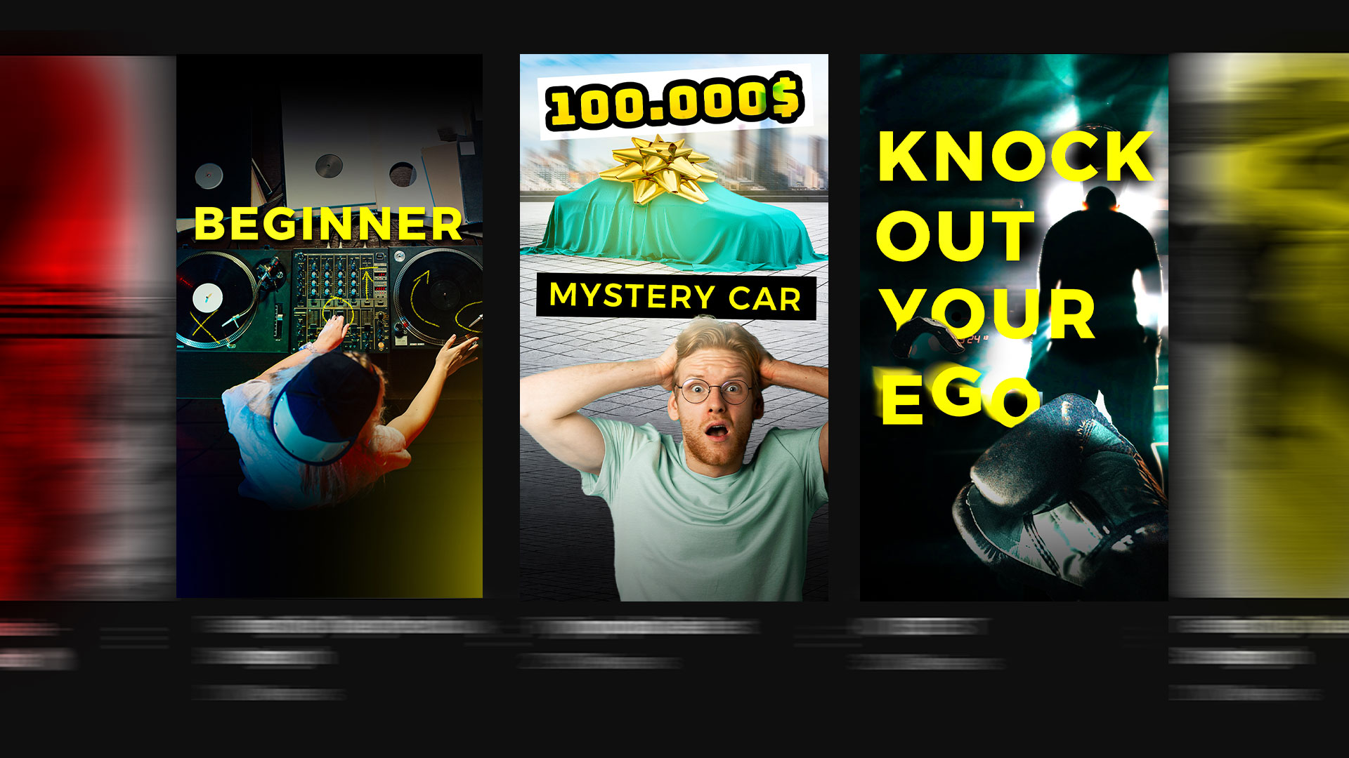
A special part of the project was a MrBeast-style thumbnail: hyper-realistic, highly saturated, with a clear shock element, a formula proven to pull in millions of views. I also made a thumbnail for boxing and martial arts, where the focus is on strong contrast and a more aggressive aesthetic that carries the energy of the ring. Both approaches share the same logic: maximum visual impact in the first second.
When a thumbnail has to fit a narrow format
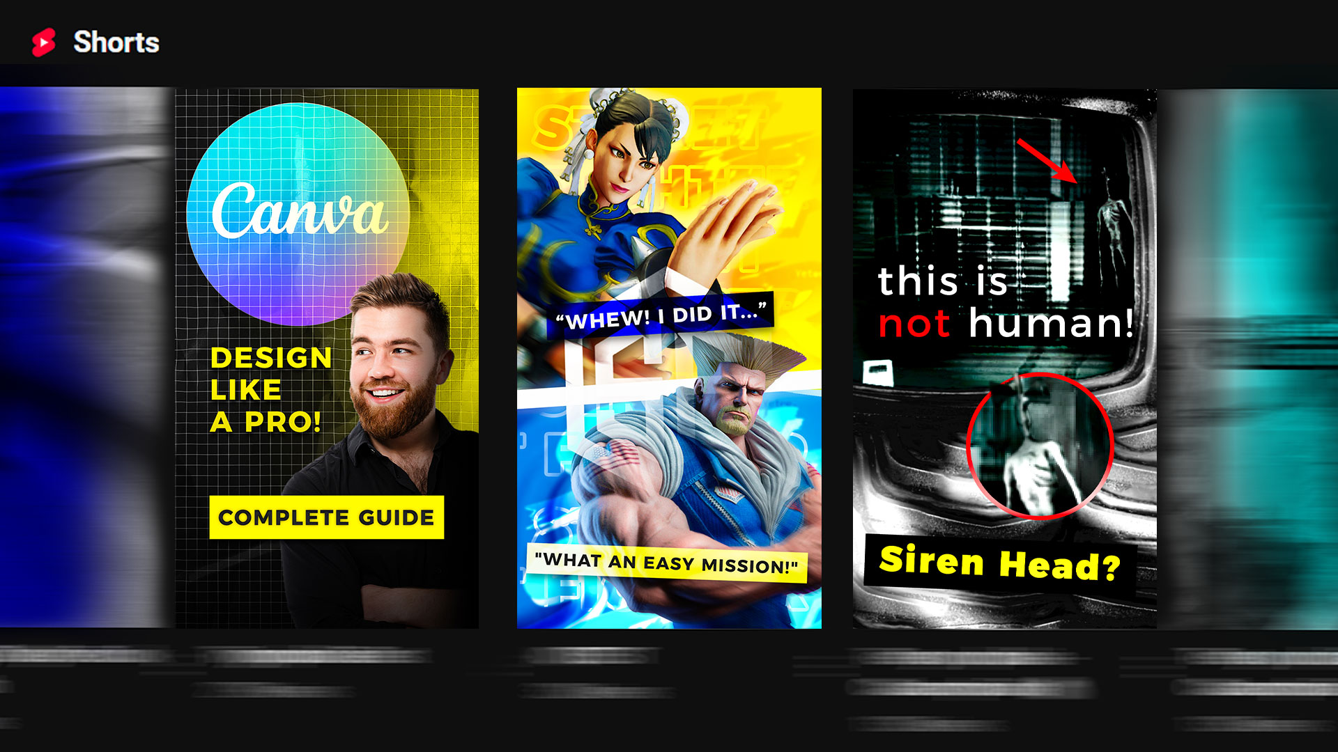
Alongside classic horizontal thumbnails, I also made versions for YouTube Shorts and vertical formats. Same creative logic, but now everything has to fit a narrower space and still pop instantly on a phone, because people scroll even faster there than on desktop.
If you run a YouTube channel and need thumbnails that actually bring clicks, get in touch. I love doing projects like this for creators and brands.