


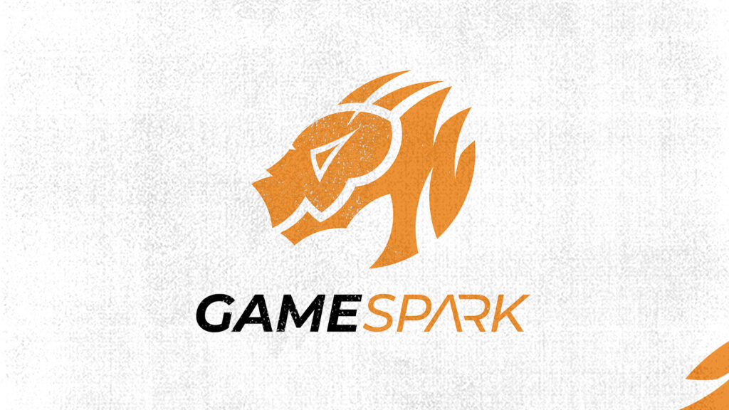
GameSpark logo: from DragonZone to Sparky the dragon
GameSpark is a gaming sub-brand I developed for Technology Park Varaždin. The goal was to create a modern, striking visual identity that respects local heritage while staying deeply connected to contemporary gaming culture.
When the first concept just doesn't work
The original concept was called DragonZone, but I had to change creative direction because the original visual style was too baroque, ornate and detailed for a gaming audience. I redefined the brand and renamed it GameSpark, a name that brings together the world of gaming and the spark that stands for energy and fast innovation. The word spark also contains the word park, which creates a subtle link to the parent brand, Tech Park, while keeping a recognisable gamer aesthetic.
Sparky and the golden ratio
The centrepiece of the identity is a dragon called Sparky, a direct link to the mythological creature historically associated with Varaždin. I constructed the icon on golden ratio principles, so every curve and intersection is mathematically aligned for maximum visual appeal. I also made a 2D logo animation that reveals this geometry dynamically, turning a static mark into a living digital form.
A colour that ties three sub-brands together
The colour palette is designed to work within Tech Park's wider ecosystem: green represents the parent brand, blue belongs to the Voogle sub-brand, and the warm orange palette belongs to GameSpark and brings in the energy of a gaming identity. For typography I used Montserrat, bold for headings and the logo and medium for subheadings and body text, for maximum legibility on screen and in print.
If you need a complete visual identity for a brand or sub-brand, including a logo, colour palette and animation, get in touch. I really enjoy complex branding projects like this.